
Tools used: QGIS 3.34.3 Prizren; Inkscape 1.2, a web browser
Most of this is reasonably standard ‘get data, make maps’ – you can flick straight to cartographic magic for the un-standard parts if you want!
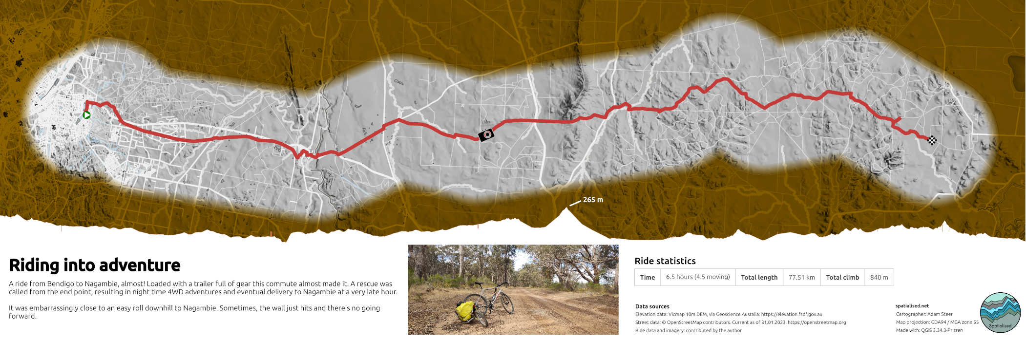
The product
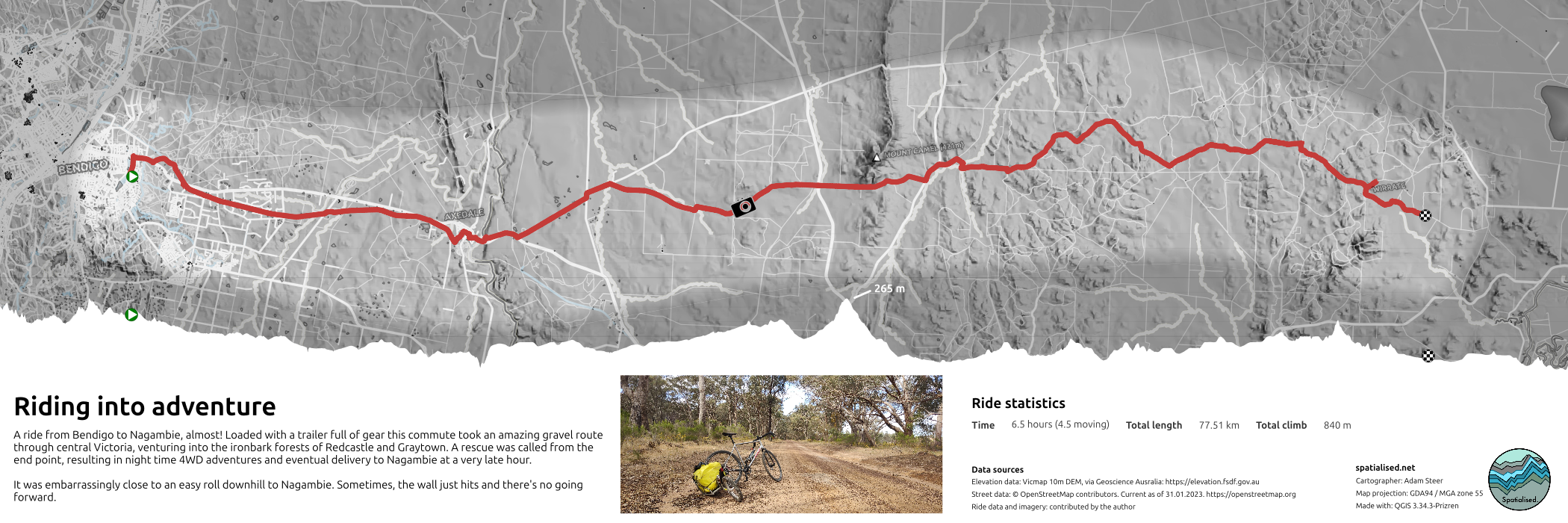
Brief and design choices
The brief for this map was to visualise a bicycle ride route – and tell a little story about it in a simple and uncluttered way. Because the ride was quite linear, a strip map layout came to mind easily. Masking map detail outside of the route area was also planed as a way to bring focus to the ride route itself. For colouring, the idea was to keep things neutral and desaturated – with the exception of the ride route.
Data choices and access
The ride route was a GPX extracted from Strava. This was downloaded from my Strava account.
For OpenStreetMap data, I used the OpenStreetMap web interface to select a bounding box, then obtained data by following the provided link (left panel) to the overpass API:

This provides an OpenStreetMap XML dataset, which can be loaded directly into QGIS. I strongly recommend exporting the data as a Geopackage with a spatial index before starting work.
I used 10 m resolution terrain data from VicMap, downloaded from Geoscience Australia via elevation.fsdf.gov.au. Here you can draw a bounding box:

…and then choose from data found within your region:
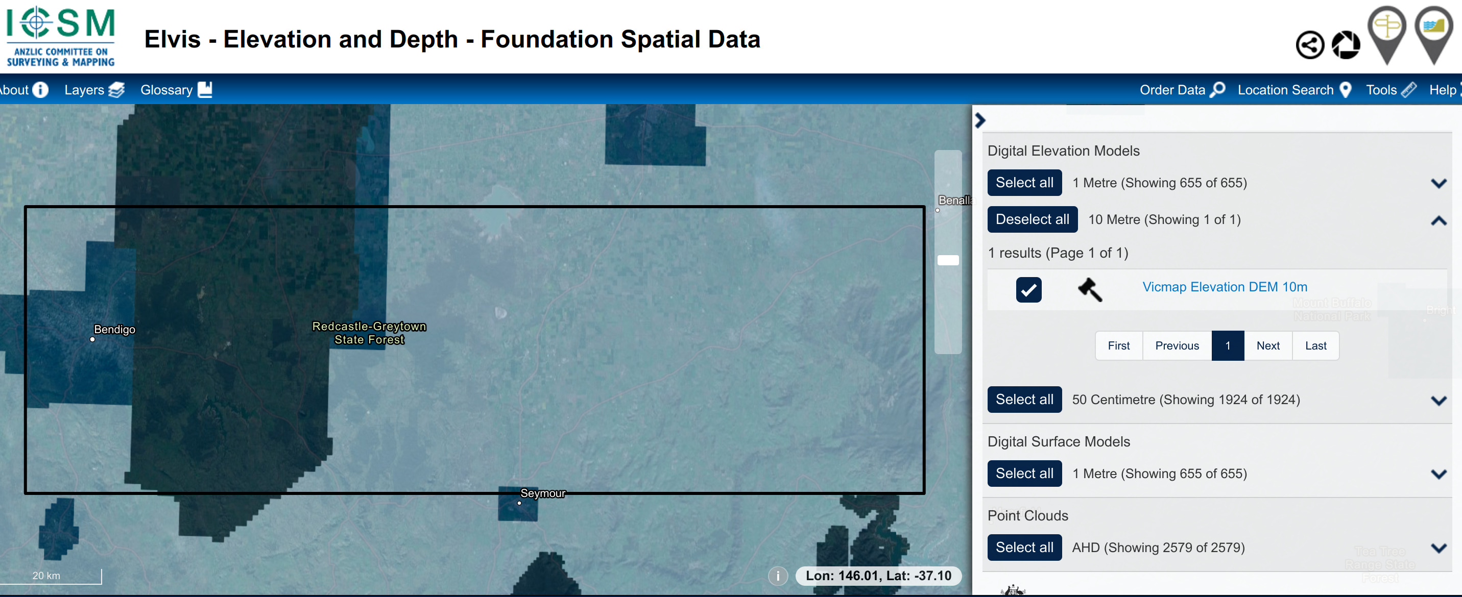
There’s a wide range of projections and formats you can choose from to get your data. I chose to obtain GeoTIFF data projected to GDA2020/MGA55.
Assembling the map
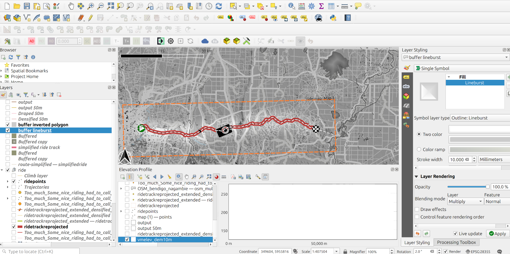
This is all about how the map was built. It hopefully exposes some useful QGIS tricks! The first QGIS trick is that I’ve added the first layer, I add an openstreetmap WMTS layer (browser pane -> XYZ tiles -> OpenStreetMap). This helps me get around and find places as needed. Until then, it sits there, turned off. I generalyy start the map composer as soon as I start styling vector data, to check on their final render sizes.
My workflow is not necessarily organised. Here’s my QGIS desktop at the end. There were many badly named temporary layers created in the making of this map, and the data are not necessarily cleanly organised – although it is all in one location!
Elevation
The first layer to start work on was the base elevation. I chose to use a multi-directional hillshade, exaggerating the relief quite a bit:
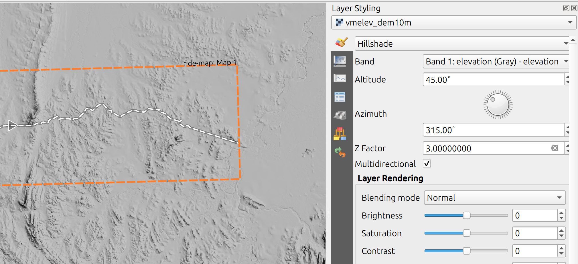
As the base layer of the map, this is rendered in normal mode. Because the data are expressed in GDA2020 / MGA 55, QGIS chose this as the project coordinate system. Everything in metres!
Just a quick note – in the screenshot above, the black and white dashed lines are from an elevation profile picker. We’ll get to that later. The orange dashes are a QGIS decorator to show extents of the map composer window: View -> Decorations -> Layout extents
Ride route
Next in was the ride route. From the Strava GPX file, I loaded all the available layers into a group. Strava GPX features are expressed in latitudes and longitudes. This is fine for showing points on a map, however if we want to compute things based on the data it’s better to reproject to a metres-based system. What you see on the map is reprojected to GDA2020 / MGA55.
I wanted to experiment with ride speed, using Anita Graser’s Trajectools plugin to compute speed at each point. It was too cluttered – remembering that a lot of visual detail is coming soon, and the point is not to show how slowly I can ride up hills:
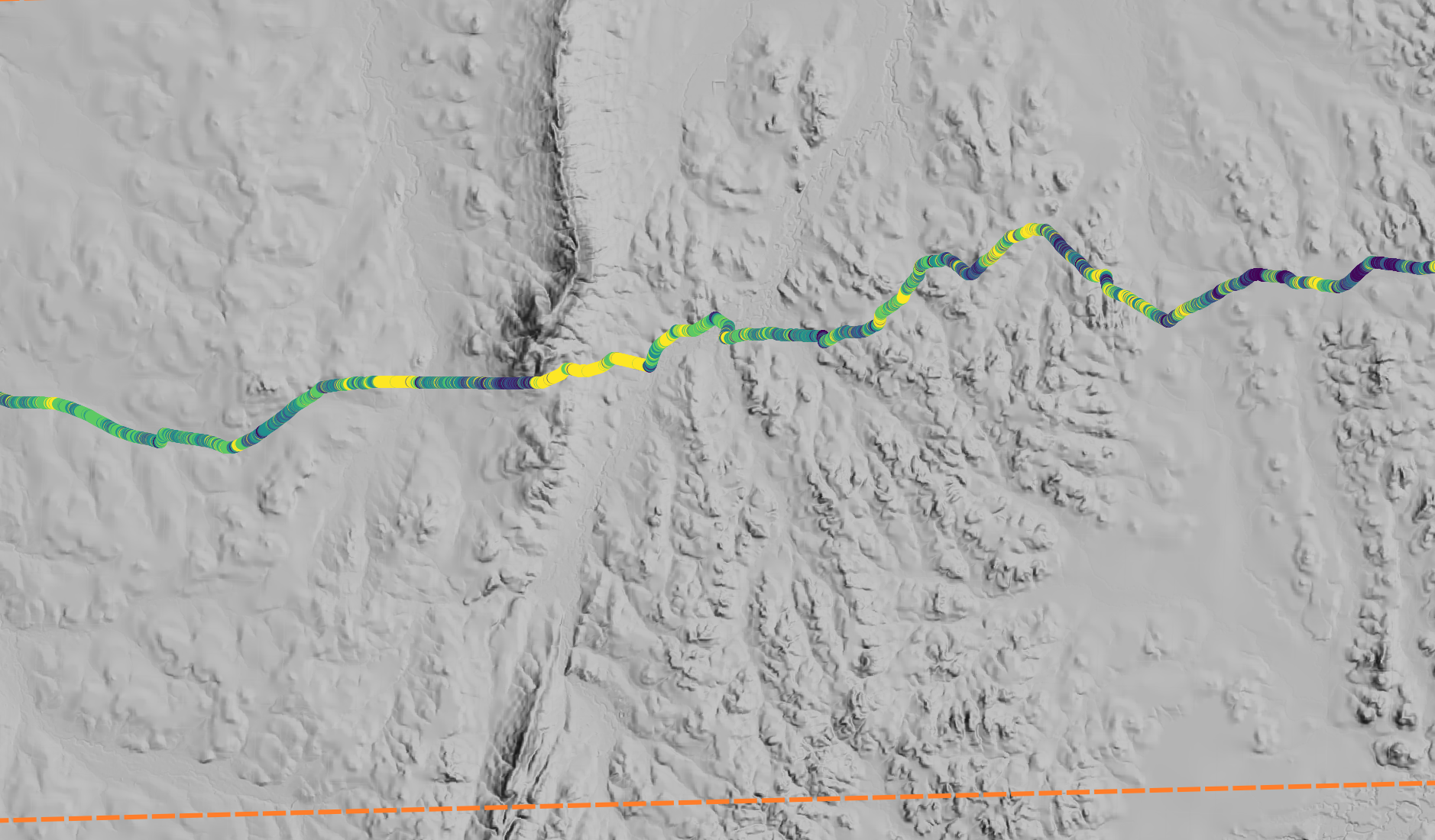
…so I removed the colouring-by-speed and stuck with rendering the track line feature. And painted it a burnt red. I didn’t kill the GPX layers off just yet, mainly for the purposes of this write up. I will remove them from the project soon enough.
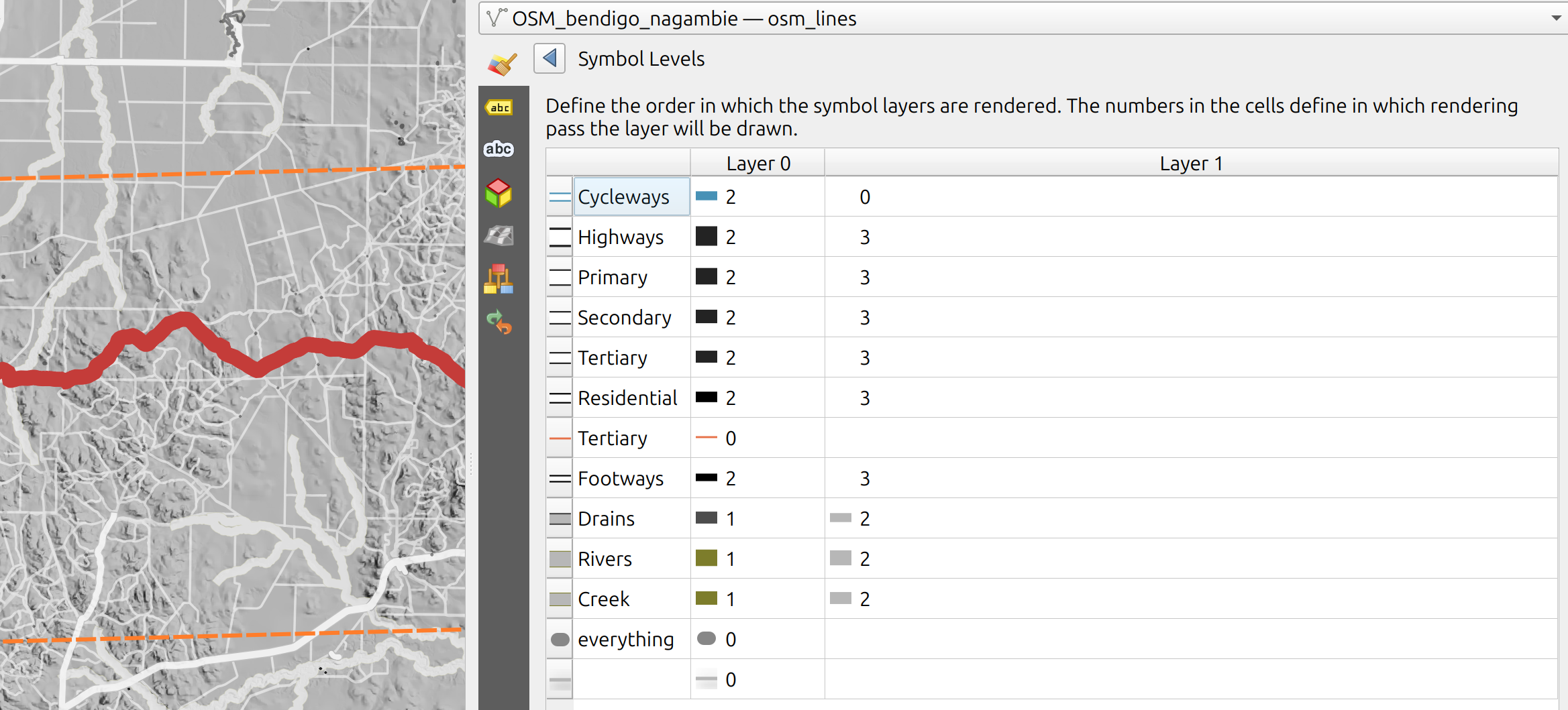
Styling OpenStreetMap
Next was styling OpenStreetMap data. This took the most time to get ‘just right’, re-learning what everything is tagged and remembering some styling practice. The key one is this: when rendering OSM roads, I’ve used a two-line symbol consisting of a dark base and light centre. The light centre must be rendered after all of the dark bases have been laid – in order to show continuous light centres which are not interrupted by black line ends. QGIS has symbol level control to make sure things are rendered in the order you want. Here’s my rule panel:
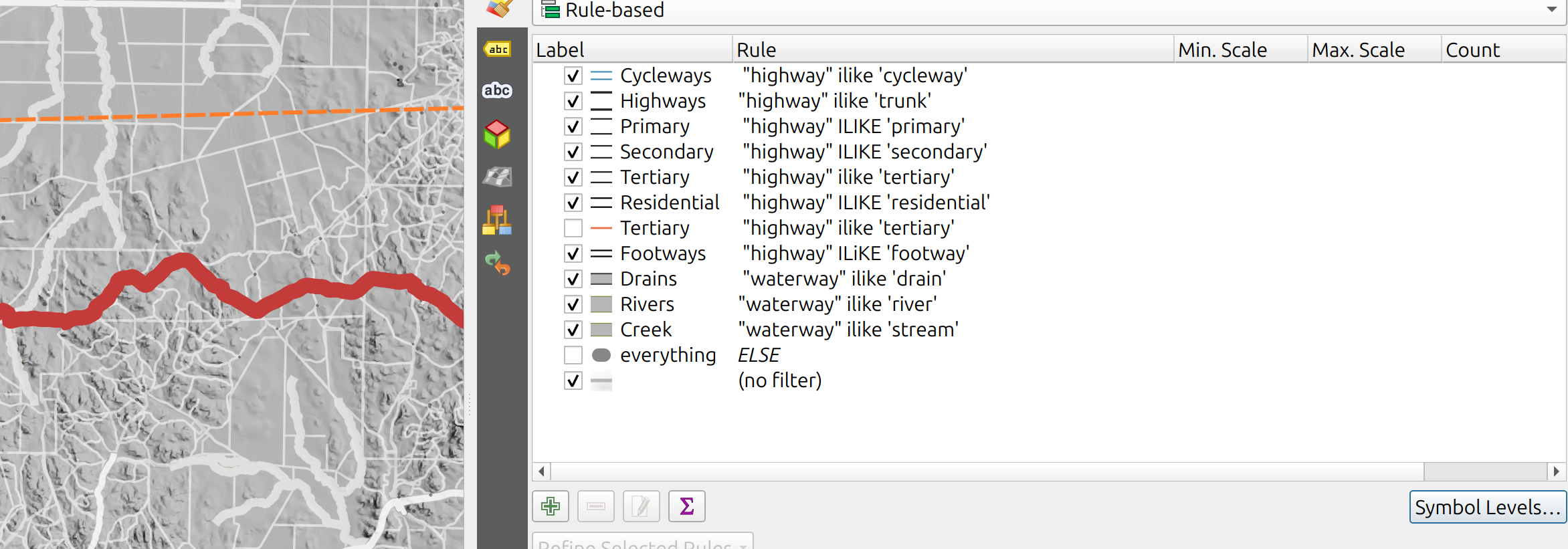
…and here are my rendering orders:
I learned this technique from QGIS Map Design – I’m not paid to promote the book, it is just a good resource. Unfortunately due to shipping costs, sizes and weights I had to give my copy away along with a pile of other mapping books when I relocated back from Norway. Fortunately, it went to a good home!
For a print map, also think about the size that the roads and lines will be rendered on paper. The screenshots above look like visual garbage – this is why I start the map composer early, and constantly flick between the two for assessing the impact of style changes.
Ride event icons
Start and end icons for the ride were drawn in inkscape – and can be found here: https://gitlab.com/adamsteer/qgis-svg-icons
Something I learned is that QGIS rendering doesn’t respect Inkscape’s clip mode for SVG rendering. Making the finish dot, I drew a checkerboard pattern and clipped it with a circle. QGIS rendered this as a circle on top of my checkerboard! To fix this I had to head back to Inkscape and create a new overlay circle for each square that needed clipping, and intersect the two.
This was satisfactory to QGIS – and Inkscape’s ctrl+d object duplication shortcut helped immensely.
The camera icon is a standard QGIS SVG with some styling applied. The placement comes from interrogating EXIF data from the image used below the map. I added the point feature, then used the vertex editor to update it’s position. This layer’s CRS is EPSG:4326 – latitudes and longitudes – because it saves a reprojection step for manually entering coordinates.
Feature labelling
Labelling was a last minute choice, added in the print composer. Using the OpenStreetMap WMTS layer I picked on a few key features, rather than label everything. Running with a low key theme, these are rendered as white text with a black outer glow, with text and glow sizes reducing as the feature gets ‘smaller’. Using the multiply render mode gets them imprinted on the landscape, with some judicious placement for readability.
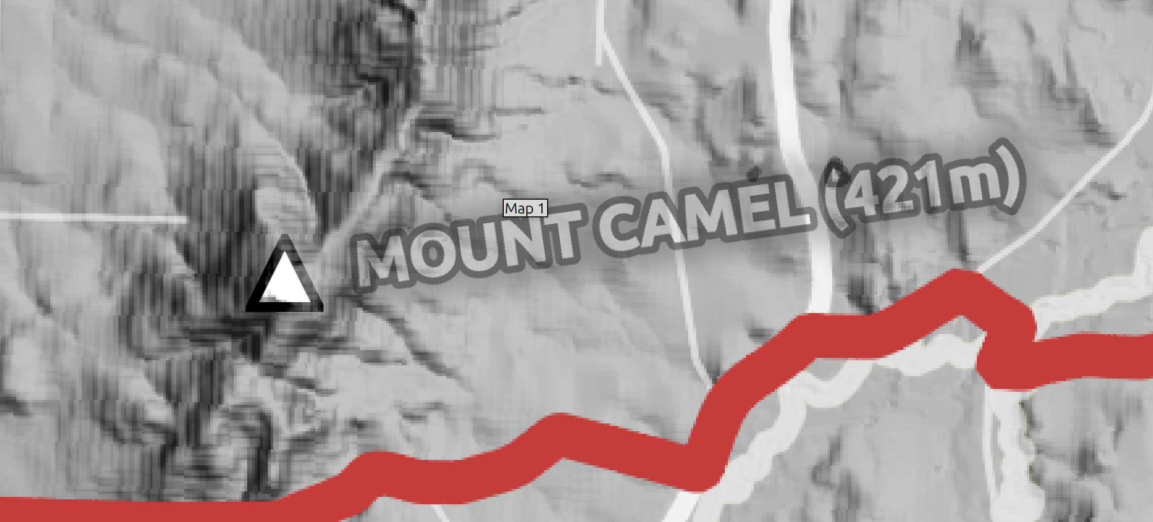
I went with all capitals because the labels are quite subtle – so we can shout a little bit…
Map marginalia
Using print composer I wrote a little story about the map, added a visual element to show what a fair amount of the ride actually looked like, and added the necessary details – data attributions, projections, tools. And branding! There’s no real magic there, the aim was to try and balance all the things.
Cartographic magic
These are the nonstandard parts – things that take a little magic.
Masking the background
There were several steps to making a mask to de-emphasise details outside of the area of interest. Yes, we could buffer the ride line to 5km – and I did! It made a pretty weird blobby shape that wasn’t so nice to look at. This colour scheme really didn’t help!
So it had to change.
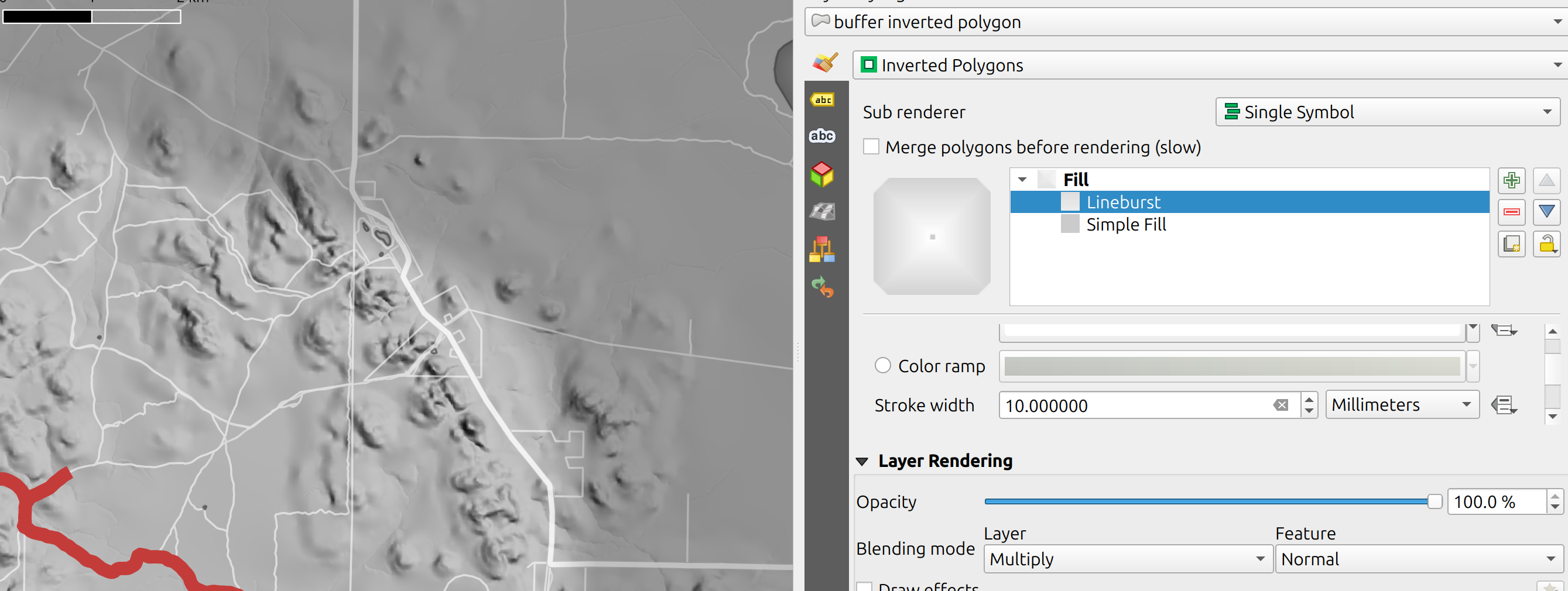
Using v.generalize from the GRASS processing toolbox I simplified the ride line, and then buffered the simple / smooth version with a very low segment count (2). I then hand edited the buffer to smooth out some jankiness. This is styled using QGIS’s inverted polygon renderer – meaning everything outside the polygon is coloured – and set to multiply rendering mode.
…but how is the feathering effect achieved?
I made a copy of the layer – using the same data source – and rendered it as a simple feature with a lineburst. The lineburst runs from white to the same color as inverted polygon (below, the inverted polygon is rendered differently to show the effect). The line width is set to the size of blur I want, then it is then offset just enough to make the two layers seamless. In this step, pay attention to the join and end styling for the polygon – I used miter and square cap to make sure my slightly-sharp-cornered feature rendered how i wanted it.
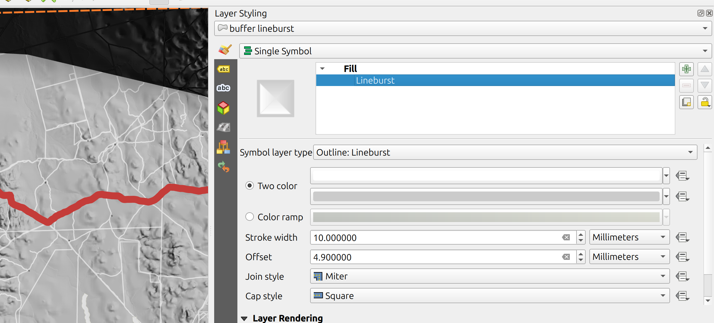
Using a shapeburst on the copied layer also works – I just could not get the two layers to cooperate as seamlessly. Offsetting the shapeburst internal polygon left tiny gaps around its edges, which ruins the effect.
I also realised that the same effect can be achieved with just one layer. Set the masking layer to inverted polygons, then add a new symbol level to the same layer and rendere it with a lineburst – then adjust the lineburst line width and offset as needed:
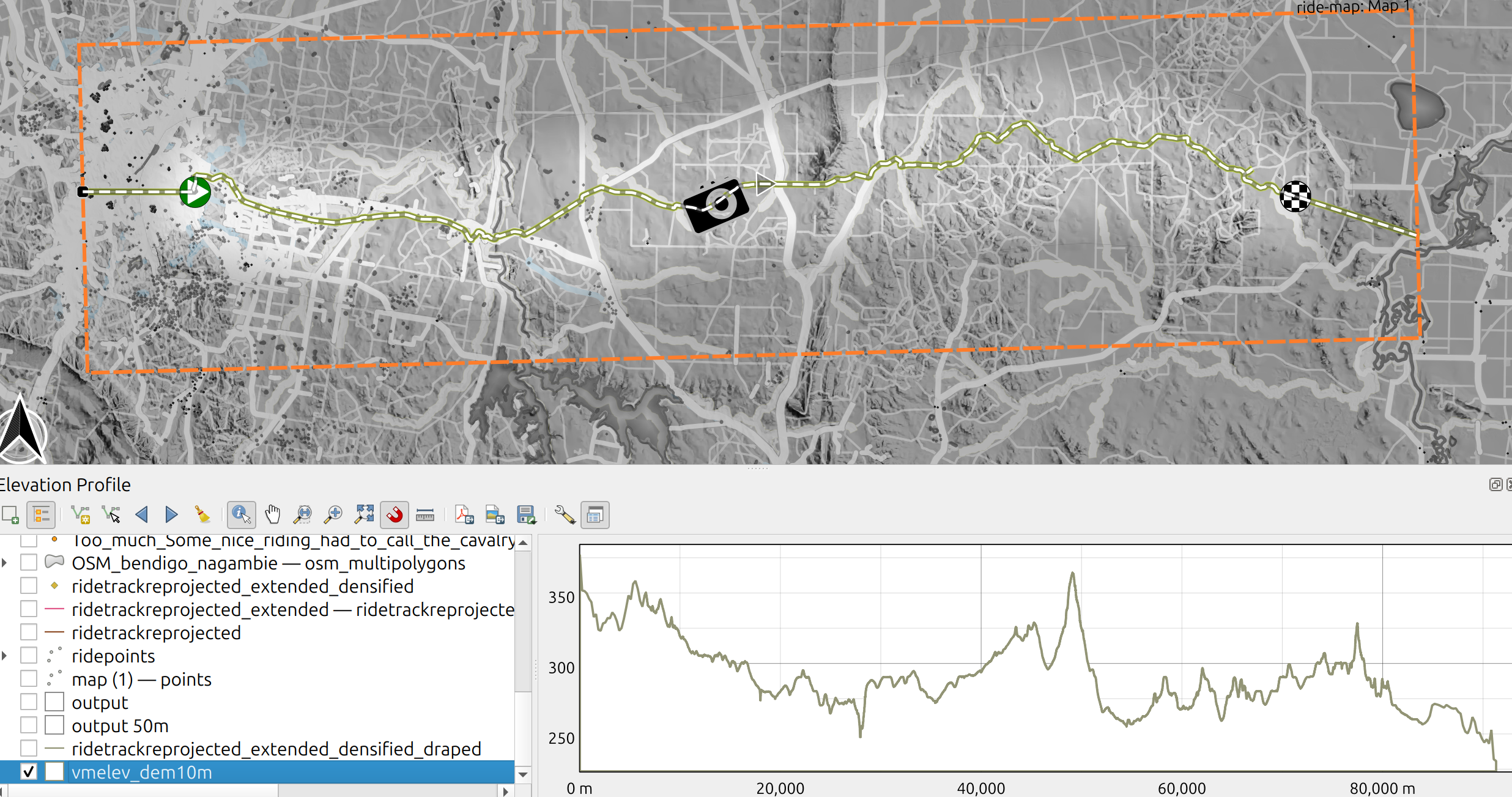
An elevation profile neatline
The next cartomagical trick is the elevation profile neatline. This came about by accident – I wanted originally to plot a profile in the marginalia, and was tinkering around then thought… ‘hey… wait a minute – why don’t I plot it along the bottom of the map?’ took a while to get just right! I set up an elevation profile (view -> elevation profile) in the main map window. Then, I used capture curve from feature (red arrow points to it below) to grab a profile along my ride line to get something like the result below:
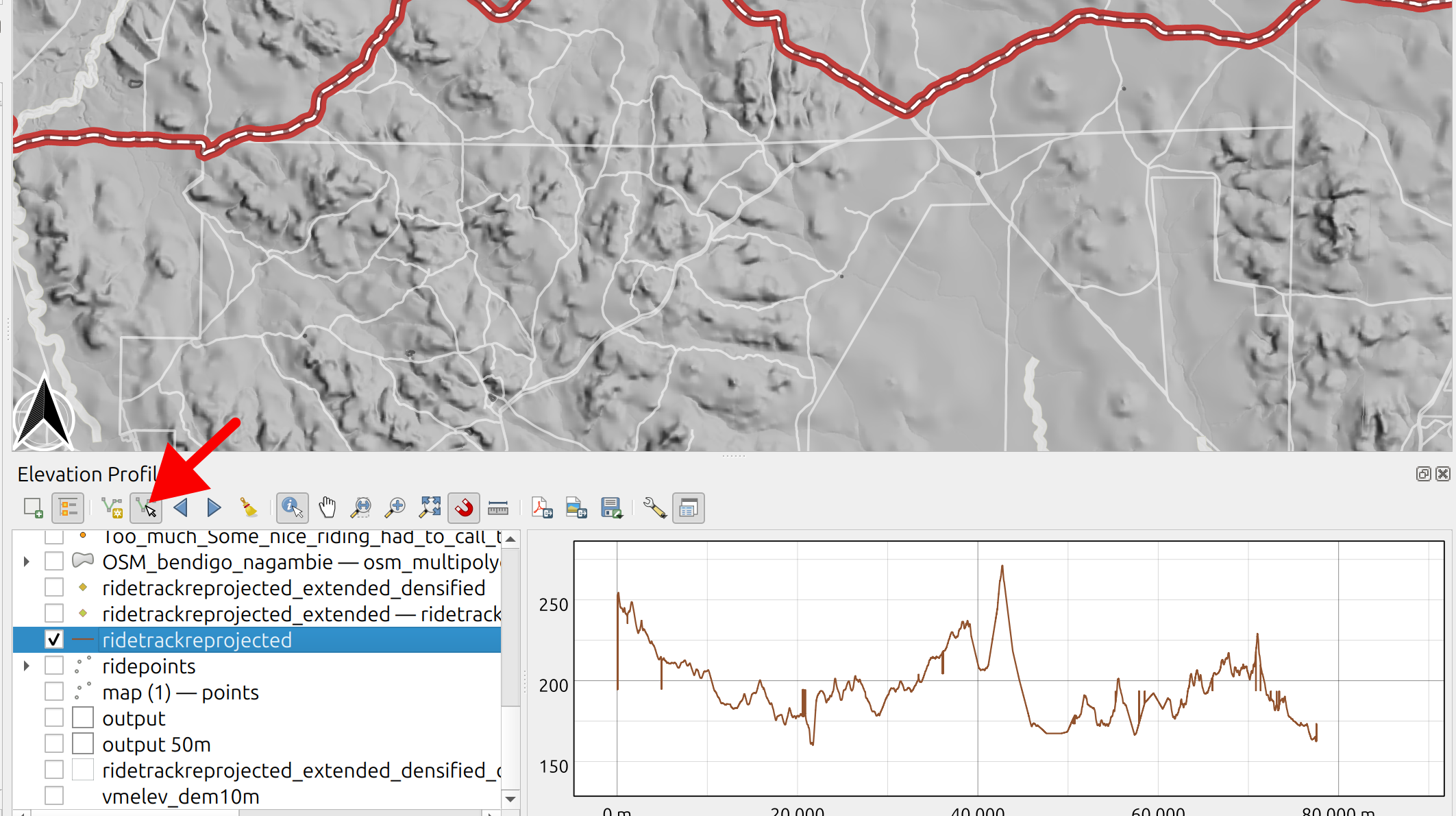
What took a while to figure out is that profile styling needs to be done mostly in the map view – there are not many available tweaks in the map composer! Double click a layer in the elevation profile browser to style it. I landed on styling the profile using line, and fill below. I set the line and fill color to white / #fffff.

After quite some trial and error I kept getting wonky outliers in the profile, sudden elevation jumps and dips. I tried quite a few rounds of densifying my new ‘full map length’ feature and draping it on the DEM to extract elevations at different scales. In the end I just cheated! Here is the basic process:
1. Capture curve from feature using the feature you want – in this case my extended ride route
2. In the elevation profile window, deselect all layers except the base DEM
3. Style the DEM line with fill below, and set the colour you want. Then choose a slightly thicker line, matching the fill colour, to mask tiny DEM errors
Moving to the print composer, I added an elevation profile feature and copied settings from the elevation profile I’d set up in the map window. This was a bit of a click-and-hope, and somewhat of a mess at the start – I tweaked knobs until I got it right! First, set all the units for axes to metres – there’s a small glitch in the QGIS version I used in which ‘kilometres’ are not scaled correctly in the print composer elevation profile.
Then, stretch the component to where you want it (click and drag the corners). To get rid of the axes, I set all the axis lines to ‘no line’, and set the label intervals to a few million metres – this cleaned up most of it, leaving a profile that matched my map background colour.
After all that, I didn’t figure out how to remove the label at [0.0]. So I did the time honoured ‘put a rectangle over it’ trick.
I then grew dissatisified with extending the ride profile – shorter than the displayed map – to the edges of the map. I went back and extended the ride profile to the map composer bounds – making a copy of the ride path, grabbing the endpoints with the vertex tool and extending them to the print composer view edge roughly in line with the ride path. Remember back at the start of this piece I wrote about the composer extent decorator? Here’s where I used it! After creating a feature which actually covered the length of the map, I repeated the whole process above. Fortunately, it went faster this time.
There’s one major trap here: if you change the profile settings in the main map window, just double check that all is well before refreshing the profile in the print composer.
As a finishing touch I added a few visual cues – labelling the height of the highest point and placing start / end icons roughly in the right place.
Wrap up
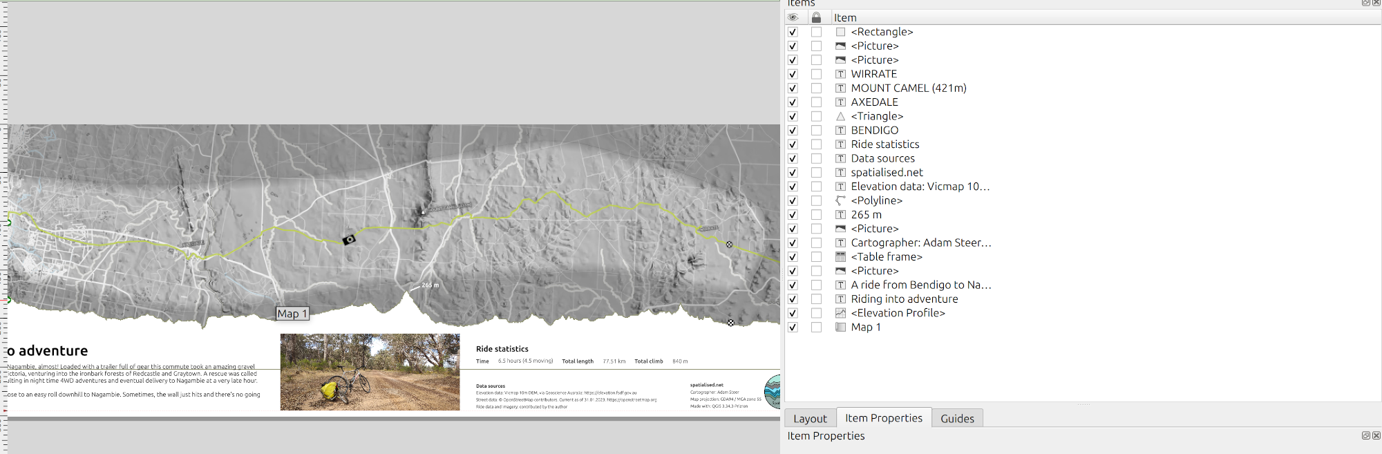
I think it’s worth showing the list of stuff in the map composer at this point. It gets to be a lot even for a simple-ish looking map (and you can see the a grey line below the profile neatline cutting through the text, because I coloured profile stroke on for empahsis in the screenshot above!)
This map went from an idea to knock out a quick map, to a multi-day exercise in cartographic revision. And it’s helped to refresh some fairly rusty skills. Above all, it was fun to do!
I like the map itself, and the profile neatline was a stroke of serendipity that I’m really happy with. As was working out how to feather a masking layer. I’m still not 100% happy with the marginalia block – I am not sure I ever will be. Although, all I can think of to say is there. Perhaps a date would be a useful addition if this were a map for a client or public display.
I also learned that a lot of houses and buildings in Bendigo and surrounds are not drawn in OpenStreetMap! Perhaps some MapTimes will start to run locally in future.
I hope you’ve enjoyed the story and the map – and that you can use some of the components yourselves. And now, the sales pitch…
The sales pitch
Spatialised is a fully independent consulting business. Everything you see here is open for you to use and reuse, without ads. WordPress sets a few cookies for statistics aggregation, we use those to see how many visitors we got and how popular things are.
If you find the content here useful to your business or research or billion dollar startup idea, you can support production of ideas and open source geo-recipes via Paypal, hire me to do stuff; or hire me to talk about stuff.