
In early 2020 the combined effects of bushfires and COVID19 pushed a lot of spare time into my hands. With that, I decided to try some mapping exercises around avalanche risk in Australia’s Alpine regions. I’ve already written about obtaining and processing lidar data I used for the task – this story is about what comes next. This story is about using those high resolution lidar data to map avalanche risk factors.
I’m a backcountry skier, with professional training in avalanche risk management. I know the region I aim to map here as both a summer and winter destination. All of these things went into deciding what needed mapping, and I started with a naïve exploration of static avalanche risk factors I knew about, before heading off to other examples (varsom.no and whiterisk ) to see what is already out there.
Avalanches and static risk factors
Fortunately, the relatively static factors which contribute to the risk of having snow become unstuck from a slope when we prefer it not to are well studied – so we can put those on a static map with some certainty. It is generally accepted that these are:
- Slope angle
- Slope aspect
- Slope shape
- Presence or absence of terrain anchors
Being able put this information into a map is an interesting exercise in visualisation – however it is incredibly important that users of the map are able to interpret it well.
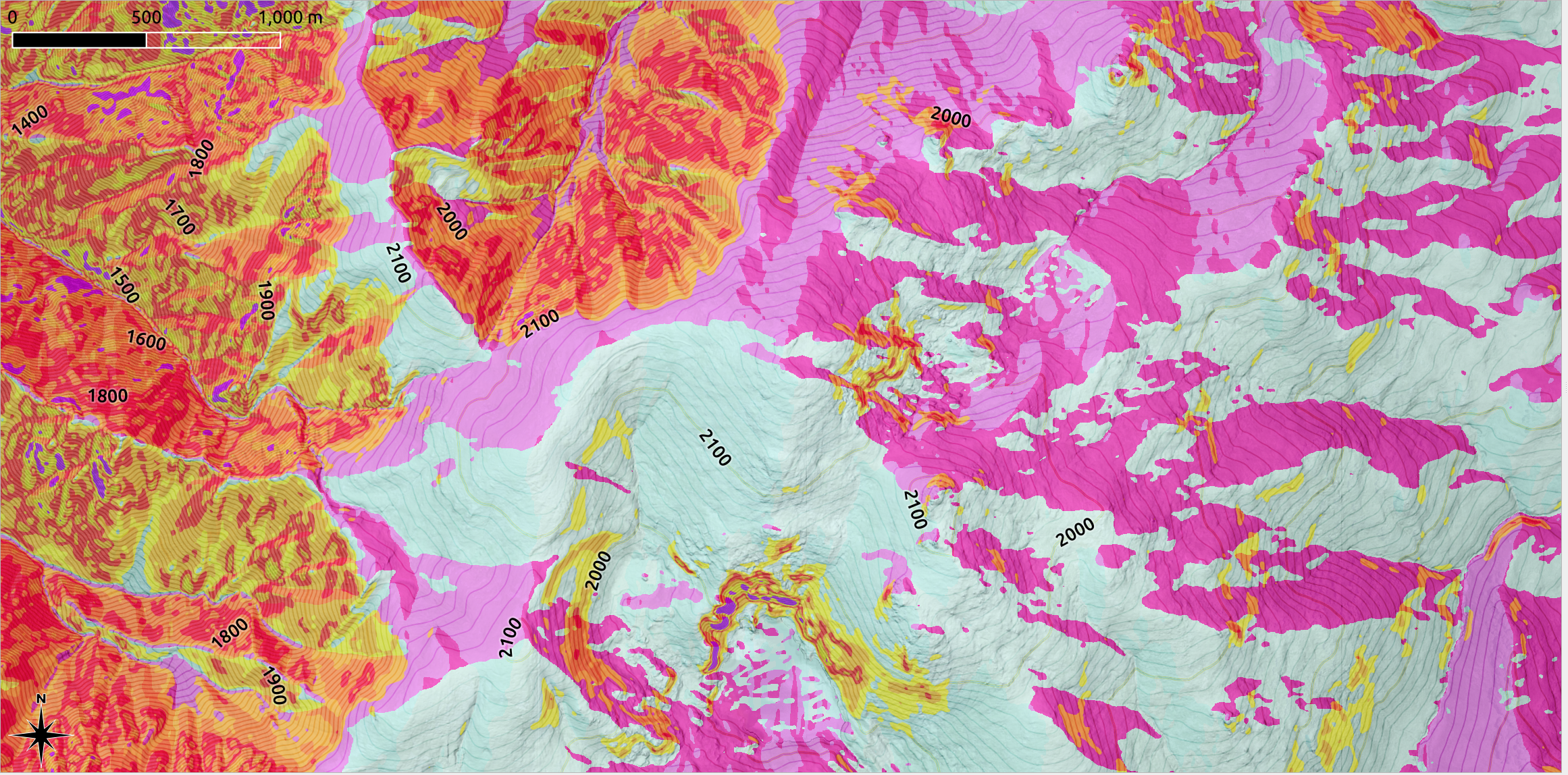
The greatest risk of avalanche triggering occurs on slopes between 30 and 50 degrees. This is represented well in any mountain safety oriented app I’ve seen, specifically varsom, whiterisk and gaiaGPS. These angles also coincide with slopes that are great to ski – with around 25-30 degrees considered a sweet spot, and 40-50 degrees the territory of people chasing steep slopes. Slope, then, is an obvious inclusion. Here, to avoid colour issues and maybe help people already familiar with using slope measuring devices, I borrowed BCA’s yellow-orange-red-orange-yellow scale from their inclinometer.
This uses a nice ‘yellow-orange-red-orange-yellow’ scale as slopes get steeper in 5 degree brackets: 25-30 (yellow); 30-35 (orange); 35-40 (red); 40-45 (orange); 45-50 (yellow), showing the ‘sweet spot’ for avalanche risk, or the slope angle which statistical analysis shows is the most common trigger slope steepness, as red. As slopes become more or less steep (fewer avalanches triggered) we paint the slope progressively orange and then yellow. There is no ‘green’ – I think also painting any backcountry terrain in green to indicate safety might provide the wrong message, so here it sticks to ‘use colours to try and indicate slopes more at risk of avalanche than others’. The main message is that avalanches can occur on all of these slopes – and for me at least this colour scheme reflects the body of statistical knowledge about avalanche likelihood nicely.
Slopes above 40 degrees have their own set of additional complex risks – however that is a separate discussion! And for this mapping exercise I’ve painted heinously steep slopes (> 50 degrees) purple. There are not that many here…

Aspect is probably the next most popular talking point – what is the exposure of a slope to sun and wind? This has a key role in determining the evolution of snow on a slope in two ways – its wind loading potential, and the variability in the range of temperatures it experiences during the day. I wanted to show both the sun exposure – in Australia northern slope see more sun, and also leewardness to prevailing winds – predominantly westerlies. While I think everyone going into the backcountry should take time to be able to read the aspect of a slope from a map, and observe where wind loading is likely, it was a fun visualisation challenge which really just failed. Here is just one of many attempts – trying to avoid reds and oranges to show northerly aspects which get more sun, and southerly aspects which don’t.
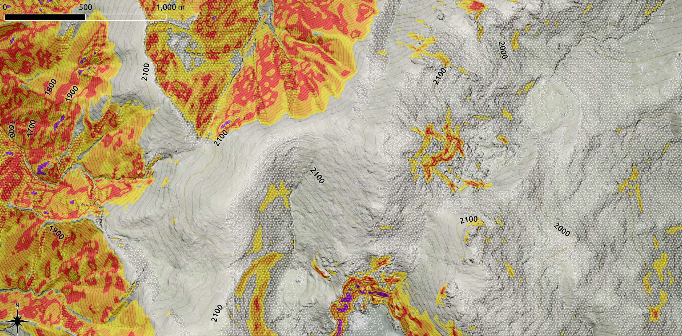
Aspect is quite visually confusing, and frankly all my attempts were awful. If I were making a web application it would be great to add as an optional layer, but for a printable / static map, it just seemed to much. I chose to focus instead on mapping only leewardness to prevailing wind, aiming to show likely spots for wind loading. WInd loaded slopes are a bit special. Windblown snow tends to be broken up, so layers deposited by wind tend to be internally cohesive but not necessarily well bonded to snow below – the notorious wind slab is notorious for good reason! It is potentially a large, cohesive, heavy unit of snow if it starts to slide. Slopes lee of the wind also develop overhanging cornices in the right conditions, yet another dynamic hazard to be aware of.
Because the map is still starting to get visually full I chose a pattern fill rather than colour patch here. It might be a bit subtle, however I think it worked reasonably well at showing right away slopes which I know get heavily wind loaded in winter.
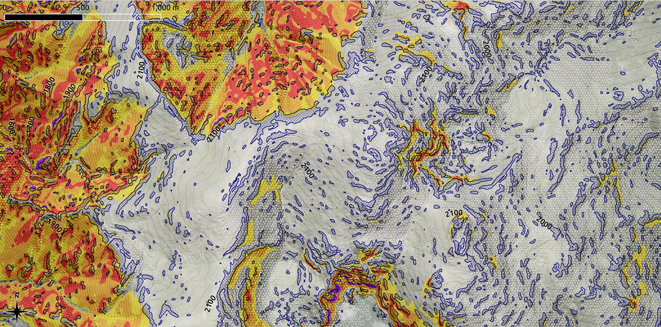
Something we don’t discuss so often is the shape of a slope. Underlying terrain shape provides clues about how snow might accumulate, and how overlying snow may to respond to loading / stress. Especially combined with other static factors like where wind loading is likely. Sure, this changes when snow accumulates, to the point where the snow surface may bear little resemblance to the underlying terrain. My aim here was to try to visualise convex features – places where the overlying snowpack may also form convex, relatively highly stressed snowpacks that are common trigger zones for avalanches.
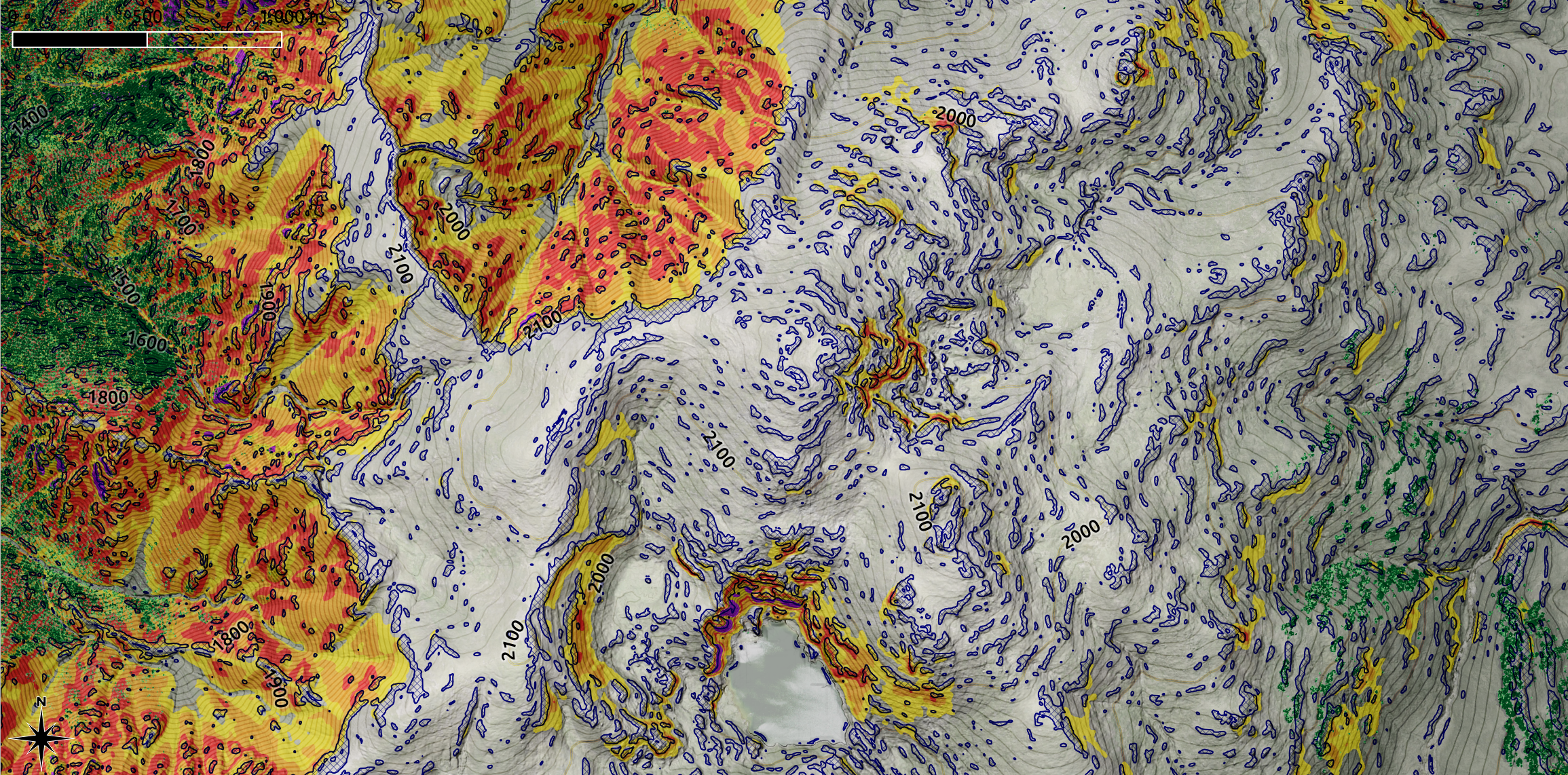
Finally, we get to terrain anchors. These have two roles – one is to act as anchors which may prevent or limit the downhill slide of snow. They may also act as trigger points, creating weak points in the snowpack from which an avalanche might propagate. This second point is hard to quantify, so here I focus on trees which are tall enough to not be buried by the snow. Because I used a well classified lidar dataset as the base, I can find all the trees and map those as well. The distribution of trees is not so surprising – in regions lee to the prevailing wind there are often fewer trees – the snow stays around longer and they cannot get growing. And sometimes, in an Australian context, heavy wet cornices fall and push them over.
In this map I’ve shaded any vegetation above 2 metres tall as greens, with darker green meaning more vegetation per grid cell. I chose 2 metres because a lot of alpine trees in Australia are pretty tough by the time they grow taller than me. It is a bit of an arbitrary choice, and I am still thinking I would push that to 3 metres if I were making maps people relied on. Also, I know I said earlier I didn’t like painting anything ‘green’ in case it was interpreted as ‘safe’ – in this case it seems appropriate and potentially not that confusable for ‘safety’. In this map, you can see vegetation in the gullies to the left, and scattered to the right. The rest of this region is more or less ‘tall vegetation free’.
Putting all these factors gets quite visually complex! Perhaps the best use case for these maps is from a management rather than casual user perspective – in terms of being able to see quickly where terrain has input to avalanche risk. These were all the static risk factors I could come up with, the rest are either dynamic environmental factors or dynamic (subjective) human factors.
And to reiterate, they are factors – not answers. The calculus of avalanche risk is still very much up to the backcountry traveller. The exercise here was to see if mapping the static components worked well enough to be useful or not. Here is a ‘finalised’ map of the region show above:

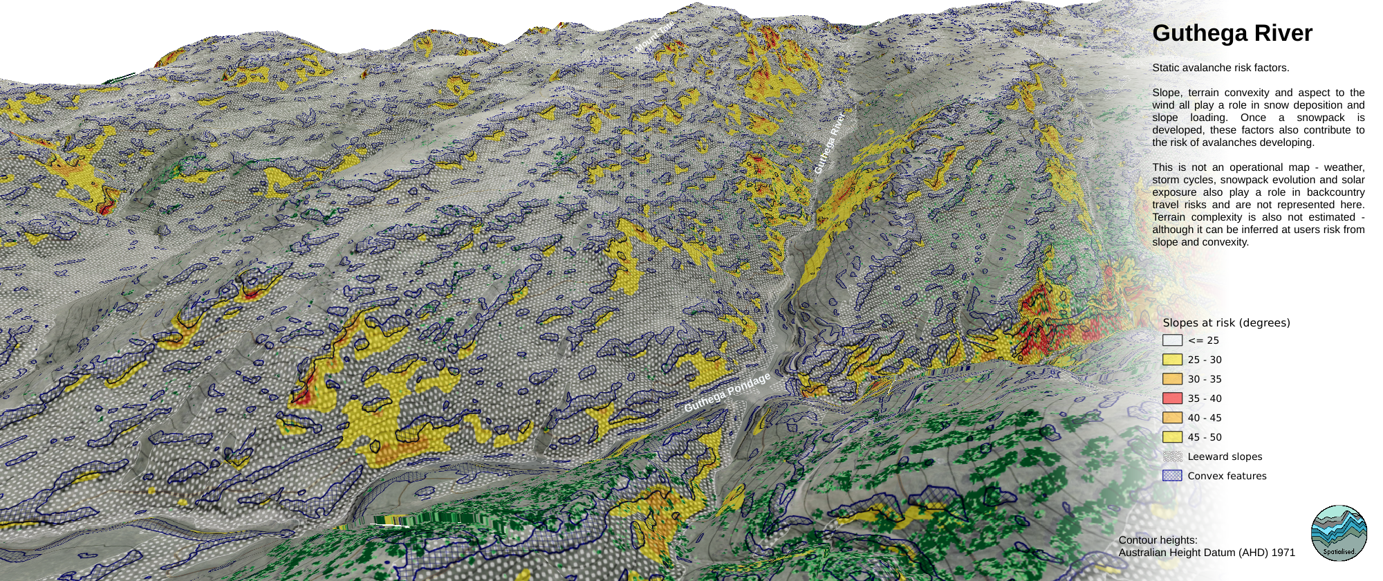
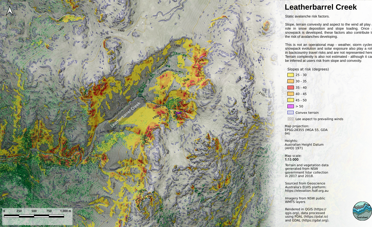
…and a couple of other popular backcountry touring areas. I should say here that all of these maps are cut from a ‘mega map’ encompassing all of the region we call the ‘main range’. So this analytical work is also done for all of the region and it is fairly straightforward to generate similar imagery for anyplace around the main range, and all of the New South Wales ski fields except for Mt Selwyn, which is pretty flat anyway. Here I chose the Guthega river up toward Mt Tate – a wonderful day trip area from an easy car park at Guthega. It is almost slackcountry! The next map is Leatherbarrel creek, accessible from either Dead Horse Gap or Thredbo resort. It is a bit harder to get into than the Guthega river valley but very worthwhile. Don’t be lazy, do it the Dead Horse Gap way…
Dynamic risks
These next two sections are a bit unrelated to making maps but I feel they are necessary to winding up a discussion about avalanche risks.
There are risks in the backcountry we cannot portray on a static map. The discussion above points a few of those, the main one being snowfall and weather patterns. All of these static risks are either amplified or reduced by how the snow falls and accumulates upon them. A strong wind event may redistribute a lot of snow, substantially altering the impact of static underlying risks. The order and duration of snow, rain, freezing and sun events also modulate the impact of underlying static risks.
In other words, never assume that these maps of slope, terrain shape and aspect provide ‘safety’ – they are clues about how an incredibly dynamic material might behave. And the rest is up to us as backcountry travellers to make ourselves aware of, to learn how we interpret terrain based factors together with how the snow sits upon them.
Subjective risks
As well as the static and dynamic objective risks we encounter in the field, we have a subjective risk to consider. This is what Werner Munter included as the ‘human factor’ in the 3×3 decision matrix for assessing mountain travel risk, and more or less wraps up into ‘different humans have different levels of acceptable risk’. Sometimes this is based on bravado, other times experience. Its impossible to know which, without knowing the human involved in the activity. And sometimes we ourselves mistake one for the other.
…because we all make mistakes. We do the best possible computation and simply fuck up. Sometimes we get really lucky – for example the time I crossed a steep and deep gully just above a well known avalanche trigger zone instead of seeing the slightly less obvious but much safer scramble up a rock spine to the ridgeline. That day we dropped some epic big mountain lines on snowboards, but we risked a lot to get there – and the next time I went to Aotearoa I did my professional avalanche safety management course. I wanted to not have this near miss again.
Other times we don’t get lucky. Touch wood I’ve never been shunted unexpectedly by snow deciding it wanted to move downhill fast, but I’ve lost the risk equation enough times in other places.
When I’m not at work I ride mountain bikes, ski, climb rocks, chainsaw things, go to remote places on my own, and raise a family. I’ve done all these things for years. I’ve also selected research sites on Antarctic sea ice, done risk assessments for helicopter landings on floating ice, filled out myriad risk analysis for working with power tools on floating ice, monitored fires for summers, navigated groups of clients in the wilderness…
…I’m pretty familiar with risk assessment and management as a practice. All of these activities have the same common threads:
- how might I die?
- how can I avoid dying?
- how can I help keep the people around me from dying?
In each scenario there are myriad practices which are engaged to make sure that we undertake a thing and come home again. Or, that we still have a home to come to. Also, every scenario has highly dynamic components overlaid on relatively static sets of conditions. So its good to wrap up this small digression now, and say that just like avalanche safety in the mountains, we can only ever hope to map out some of our risk profiles without being in the field, engaged with our awareness of dynamic and subjective risks as well.
Summary / next…
I hope you’ve enjoyed this read. It is an imperfect project in data analysis and cartography but it was fun to try. From my perspective looking particularly at slope shape was most interesting – backing up what I’ve seen in the field and being able to show where the winter snowpack might become stressed. Slope is kind of intuitive, but it is also interesting to have some field observations confirmed objectively. I’ve also tried to make sure that this mapping isn’t the end of the story, I can analyse the terrain all I want but none of that is going to ensure that I am safe in the mountains. In the end, this is up to the person moving through the terrain.
I live in Tromsø, Norway now. It is a renowned backcountry skiing destination with a lot of ski-able terrain all accessed by hiking up it. Here, varsom.no provides an excellent resource in terms of avalanche observations and warnings. It also provides a map showing terrain slope and avalanche runout zones. The Norwegian government also provides open access lidar data for the region – so an upcoming exercise will be repeating the analyses here for my new ‘local’. I’ll also be out in the mountains digging snow pits and checking in with how things look out in the real…
Reading and resources
https://www.slf.ch/en/projects/avalanche-terrain-maps.html#whiterisktourLegendDesc
https://avalanche.org/avalanche-education/
https://mountainsafetycollective.org/
Lots on youtube:
https://www.google.com/search?channel=fs&client=ubuntu&q=avalanche+safety+youtube
And a film we should all watch – Solving for Z: a calculus of risk