
I had a lot of fun making the feature image for my second open source point cloud infrastructure post – and I liked the map, so I thought I’d share the recipe.
Unfortunately, it took a while because I decided to make it better! I hope I succeeded – I certainly had more fun and took the opportunity to do some QGIS trickery I’d been hoping to try out for ages.
The story
Every map is made to tell a story. For this one I wanted to represent a 3D dataset in 2 dimensions; in a way that wasn’t something we’ve all seen before – like the usual gridded bathymetry product. These are great – but I wanted to make a point. The point being we’re doing something a bit different here.
Let’s see if I managed to get there…
The key feature
The key feature of the map is a low density representation of data obtained in the search for MH370 – which aims to show the extent and a little bit of information about the data without blowing up a laptop. Since the data are already broken up into many small chunks, it seemed natural to visualise the data using some attribute inside the bounding polygon.
Using this method also gives a nod to how the data are organised and stored. On someone else’s hard drive (and now mine), data are organised in ‘blocks’ of data points with relatively consistent point counts per block; each file is one ‘block’ and one polygon on the map.
I’ve coloured them by mean depth – but equally could have used another attribute.
How it got done
Raw data for the map arrived as chunks of ASCII text, via a THREDDS data server. Step one was creating a Siphon routine to recursively crawl the catalogue and extract the data, which then passed processing to PDAL using parallel subprocess calls managed by Python – all inside the jupyter notebook below (*aherm* don’t run like this in production!):
View Gist on GitHubPDAL converts the ASCII to LAZ, and reprojects from latitude and longitude in degrees (EPSG:4326) to eastings and northings in metres, using the Australian Equal Albers projection (EPSG:3577). There’s also a transformation matrix in there which flips the sign on Z coordinates, from positive to negative – because I like depth being conceptually and actually ‘down’.
With a pile of LAZ files, I can deploy PDAL again to extract a tight boundary from each LAZ file as a WKT polygon, and stuff it into a PostGIS table as a geometry – with the attributes ‘file name’, ‘mean depth’ and ‘number of points’ ( this could also have been done using the same Jupyter notebook I wrote above… if I’d thought about it at the time)
#!/bin/bash

path=$1
table=$2

echo $table

for filename in $path/*.laz; do

    echo $filename
    thefile=$(basename $filename .laz)
    echo $thefile
    bounds=$(pdal info --boundary $filename | jq '.boundary.boundary')
    bounds=$(echo $bounds | tr -d \")
    pointcount=$(pdal info --metadata $filename | jq '.metadata.count' )
    echo $pointcount
    thedepth=$(pdal info --stats $filename | jq '.stats.statistic[2].average' )
    echo $thedepth
    #allthejson=$(pdal info --summary $filename )

    psql -U adam -h localhost -p 5432 -d bathymetryindex -c \
    "insert into $table (filename, boundingbox, npoints, meandepth ) values ('$thefile', ST_GeomFromText('$bounds'), $pointcount, $thedepth);"

done
Once this fundamental dataset is in place, I can start to assemble the map.
Map assembly
The entire process from here is done in QGIS.
GEBCO’s 30 arc second bathymetry and topographic relief (The GEBCO_2014 Grid, version 20150318) forms the basemap. After many tinkerings, the first layer turns out to be a GEBCO grid coloured by depth, with tints ramping from blue to white every 1000 m. Here is layer 1:

The next layer is the original basemap I had in mind – using the same grid, but spending much time on an interpolated colour scheme to cover both bathymetry and elevation. In the end I abandoned trying to do one colour scale for everything, focussed on bathymetry, and made an overlay for the non-interpolated contour map, with blending mode set to ‘multiply’.

There’s a massive sea level rise there, but we’ll deal with that soon… the desired net effect here is to soften the bathymetric shading just a touch, and add some colour depth.
…but I wanted more, and found an excuse to finally draw from Steven Kay’s excellent blog post on relief maps using topographic openness. The next layer in the stack, therefore, is negative openness:
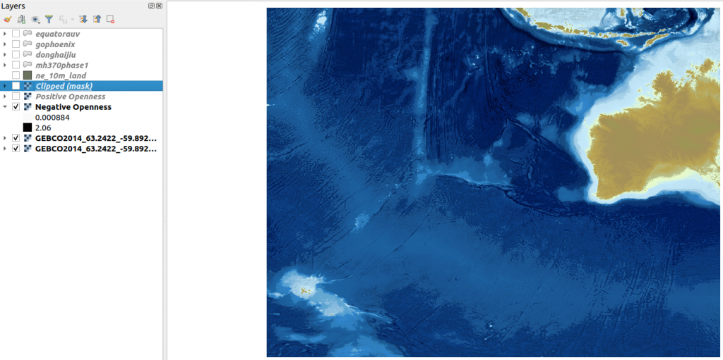
It’s a touch subtle, but pops the seafloor features out a little more. Here, Ive used a greyscale colour map, with blending mode set to multiply and transparency at 50%. I could turn the opacity up and have a really wrinkly seafloor, but this seems about right.
Next, I’ve added a positive openness layer, using a green colour ramp, with blend mode multiply and 50% opacity again. This pops up ridge features just a touch. I experimented with openness for ages before settling on using both positive and negative layers. I also experimented with colours for too long, before settling on the greyscale ramp for negative openness and the green ramp for positive. I like it, you can judge for yourself! And it’s almost certainly not an official charting colour scheme:

So we have a kind of blue/green/grey ocean now. She is never just blue!
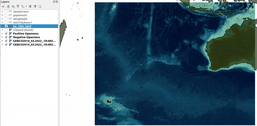
But we still have a serious sea level issue. To fix that we call on the Natural Earth 10m Land dataset, and add our first vector layer, defining landmass bounds and solving sea level issues in one hit:

Here, it’s set with blending mode…. multiply! And, a sort of drab green polygon fill. I gave it a tiny hint of inner shadow also.
So the map is a bit ugly right now – we’ll get there!
The other reason for pulling in the Natural Earth data was that I got completely over trying to balance a colour scale for both bathymetry and topography that I was happy with. It consumed much time, and never quite got there.
To address my colour ramp woes I used the Natural Earth layer to chop Australia out of the GEBCO dataset using the QGIS ‘clip by extent’ function; and worked on both sides of sea level independently. This would have saved hours if I’d thought of it earlier! And here it is:

OK! So Australia looks less ugly now. That’s great – and we still have oceany oceans with a bit of detail but not mind-bogglingly so. Let’s not get distracted, the main attraction hasn’t turned up yet.
With that in mind, Australia is pretty bright. I used my Natural Earth layer to tone it down a bit. which gives us a relatively perceptually even basemap to lay our main attraction on. And here it is:
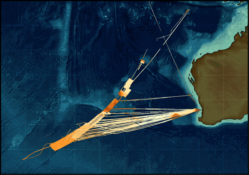
Going back to the postGIS database we made earlier, it’s time to get it to work. Adding a postGIS layer to get the MH370 data chunk bounds gives us this:

…well not really out of the box. Recall how I’d stored the mean depth of each chunk? Now, on the map, that’s used as the basis for a yellow-orange-red colour ramp. Yellow is shallowest, red is deepest, and darker hues are deeper than lighter ones. It pops out of the ocean pretty well, and still sort of has that ‘hmm, it’s not a bathymetric grid, what are we seeing here?’ feel to it. It has a tiny hint of light grey drop shadow, and is rendered in ‘normal’ blend mode – after much experimentation.
…and thats it, with only cropping to the region and potentially some map decorators to go.
I left out labelling ocean features. On the original map these were included from ESRI’s world ocean base WMS service. I wasn’t overly happy with it; and grabbed GEBCOs ocean feature label set. However, I’d be crafting custom splines / regions to align labels along for another few weeks – and this post needed to get off my desk.
The wrap up
Here’s a tidied up version with a hint of a graticule:
For me, this map meets my need to show something slightly different in a visually appealing way. I can see that it’s not a standard bathymetric grid, and may have some other story to it. The fact that we’re looking at chunks of data coloured by average depth is not super obvious – I don’t know how to make that point more clearly without drawing a mess of chunk outlines everyplace (I tried, it sucked, I stopped) – so map prettiness has won here.
I’ve purposefully left out colour scales or map features (scale, north arrow) to guide the viewer around – because it’s not a map designed to tell you about the data, it’s supposed to pique your curiosity about a story it is headlining.
However – the key question is: what does this map convey to to you. Does it get you thinking ‘what’s that – and I want to know more…’?
To finish up, I think it was worth spending the time on recreating the map from scratch – the original was nice, and did the job – but this one wins in my eyes. I hope you’ve enjoyed this write up, and gain something from it.
The sales pitch
Spatialised is a fully independent consulting business. Everything you see here is open for you to use and reuse, without ads. WordPress sets a few cookies for statistics aggregation, we use those to see how many visitors we got and how popular things are.
If you find the content here useful to your business or research or billion dollar startup idea, you can support production of ideas and open source geo-recipes via Paypal, hire me to do stuff; or hire me to talk about stuff.